UP FEUP
Designing the end-to-end application process for isolated curricular units at the University of Porto, from zero to a system processing 1,200+ applications on its first run.

The problem worth solving
In 2024, FEUP opened applications for Isolated Course Units, letting candidates deepen knowledge without enrolling in a full degree. There was no system to handle it. Academic staff processed everything via spreadsheets, placement was done by hand, and candidates had no visibility into anything.
No existing system
Applications managed entirely via spreadsheets with no digital system to handle candidates, documents, or decisions.
Need for automation
Placement rules applied by hand with no automation or consistency, every decision dependent on manual effort by academic staff.
Lack of transparency
Zero visibility for candidates, no status tracking, no timeline, no self-service. No way to know where their application stood.
How we designed it
Two weeks, two user types, one flow that had to work for both. Every decision in the process traced back to that constraint.
Two users, one flow
Maria, a UP candidate whose academic data is retrieved automatically via SIGARRA. Leonardo, an external candidate who inputs everything manually. Same entry point, fundamentally different starting points.
Friction first
Tasks mapped for both candidate types and the academic team. Key dependency: candidate progress relied on academic validation before placement could run.
Low-fi in Excel, intentionally
The FEUP dev team gave faster, better feedback in spreadsheets than in design tools. It kept alignment tight with the people building it.
Tested with 4 participants
Task completion time was tracked deliberately, because submission time fed into the placement algorithm. Average ~4 min, excluding academic history upload. No critical issues found. The step-by-step progress indicator consistently reduced hesitation.
Built from zero, shipped in weeks
No prior version to compare against. The system went live and the numbers landed on their own.
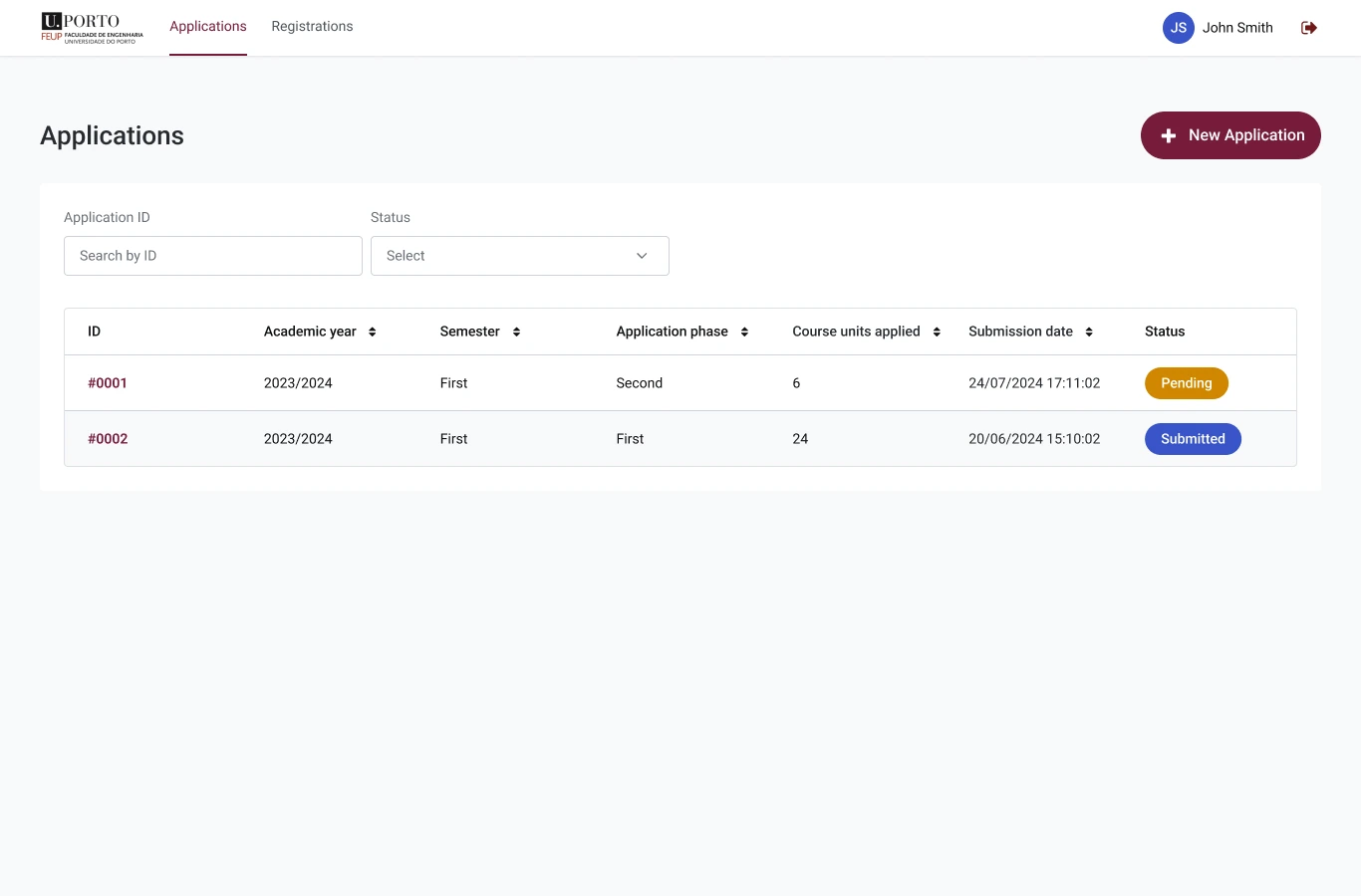
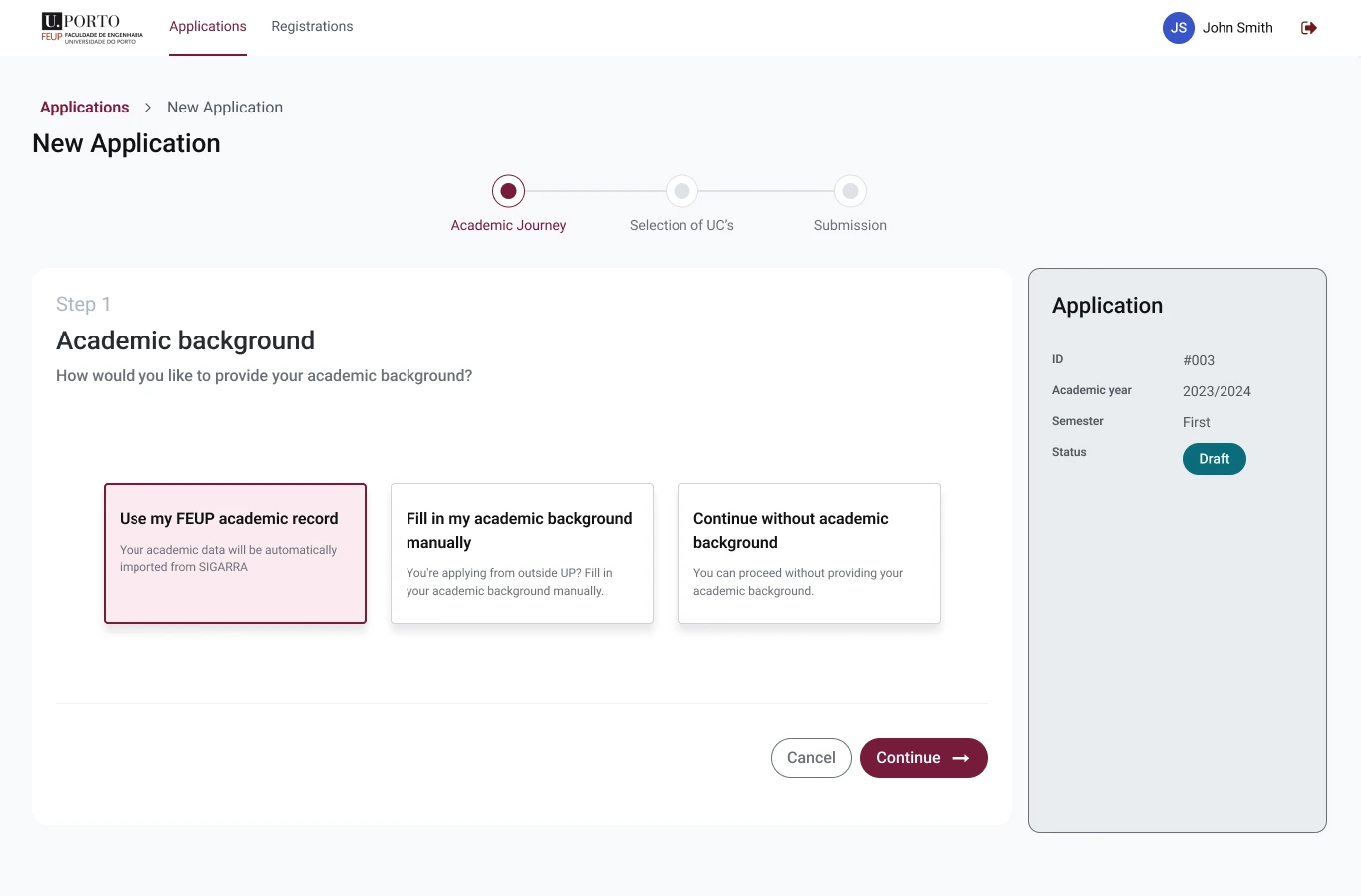
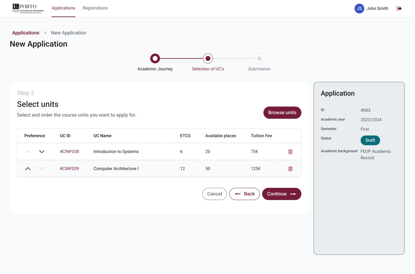
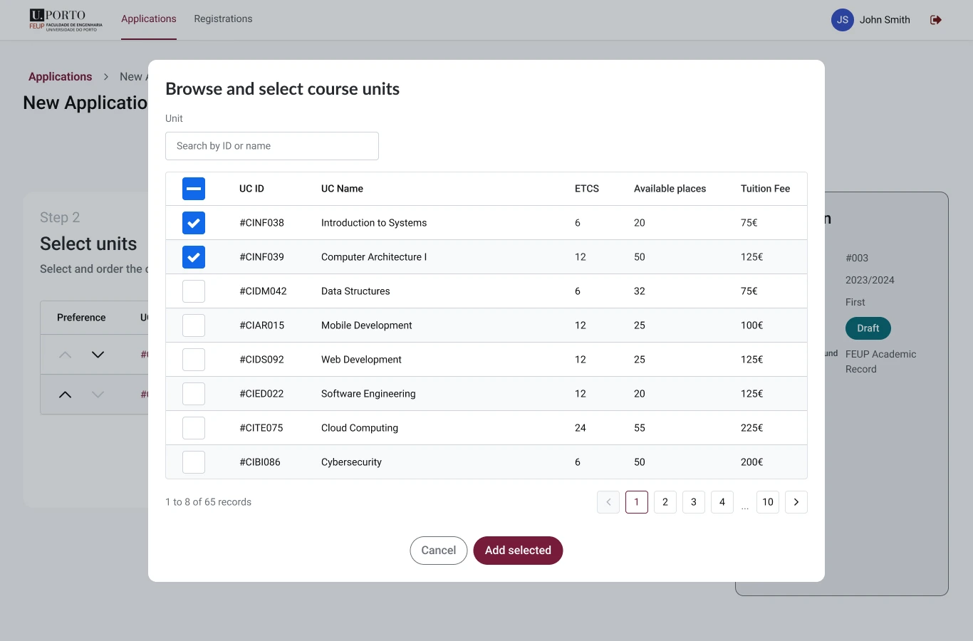
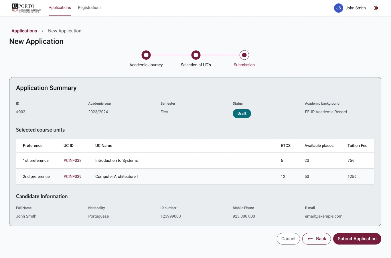
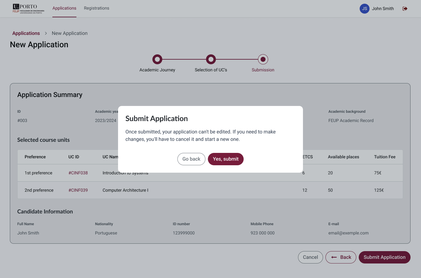
End-to-end coverage
Landing page with key dates and FAQs, dashboard for tracking, step-by-step application flow, course selection by preference, review screen, and results after placement closed.
Adaptive for every candidate
UP applicants guided with pre-filled data. External applicants could still complete the full flow. Either way, the system communicated clearly what came next at every step.
of all applications submitted on Day 1
1,209 applications in the first phase. 89% correctly submitted and validated without manual intervention.
Room to improve
Investigate the external candidate gap. 1,165 UP applications vs 44 external, too large to ignore. Research needed to understand if it's a demand issue or a UX friction point.
Refine system messages. Email, SMS, and in-app notifications should be reviewed for tone, timing, and clarity, particularly around results and required next actions.
Designing a mobile app that makes home energy consumption understandable and actionable, for a real product, from research to live launch.